Role
Design Lead
Timeline
3 months
Tools
Spreadsheets, Miro, Hotjar, UserStory, Figma
Platform
Web (Desktop & Mobile)
The Challenge
During the pandemic, 100,000+ new small business partners (SMB) joined iFood—many unfamiliar with digitalization or finance management. The existing financial dashboard wasn't designed for their needs, causing confusion about transfer dates, payment status, and future cash flow. Partners couldn't answer basic questions like "How much will I receive tomorrow?" or "Can I buy inventory today?"
Root Issues
- Dashboard showed history but not future projections
- Reports didn't match partners' mental models (spreadsheets, notebooks)
- Complex terminology without contextual help
- No visibility into "what's coming next"
Solution Overview
Led comprehensive research to understand how new partners actually managed their finances—through interviews, support ticket analysis, and observing their day-to-day business operations.
Research revealed the key insight: Partners thought in terms of time (past, present, future), not in accounting categories. They asked temporal questions: "What did I earn?" "What am I getting today?" "What's coming next?"
Growth
June → August, 2020
New SMB partners onboarded to iFood platform
SMB Sales Increase
March, 2019 → 2020
SMB Deliveries
June, 2020
47% of iFood total
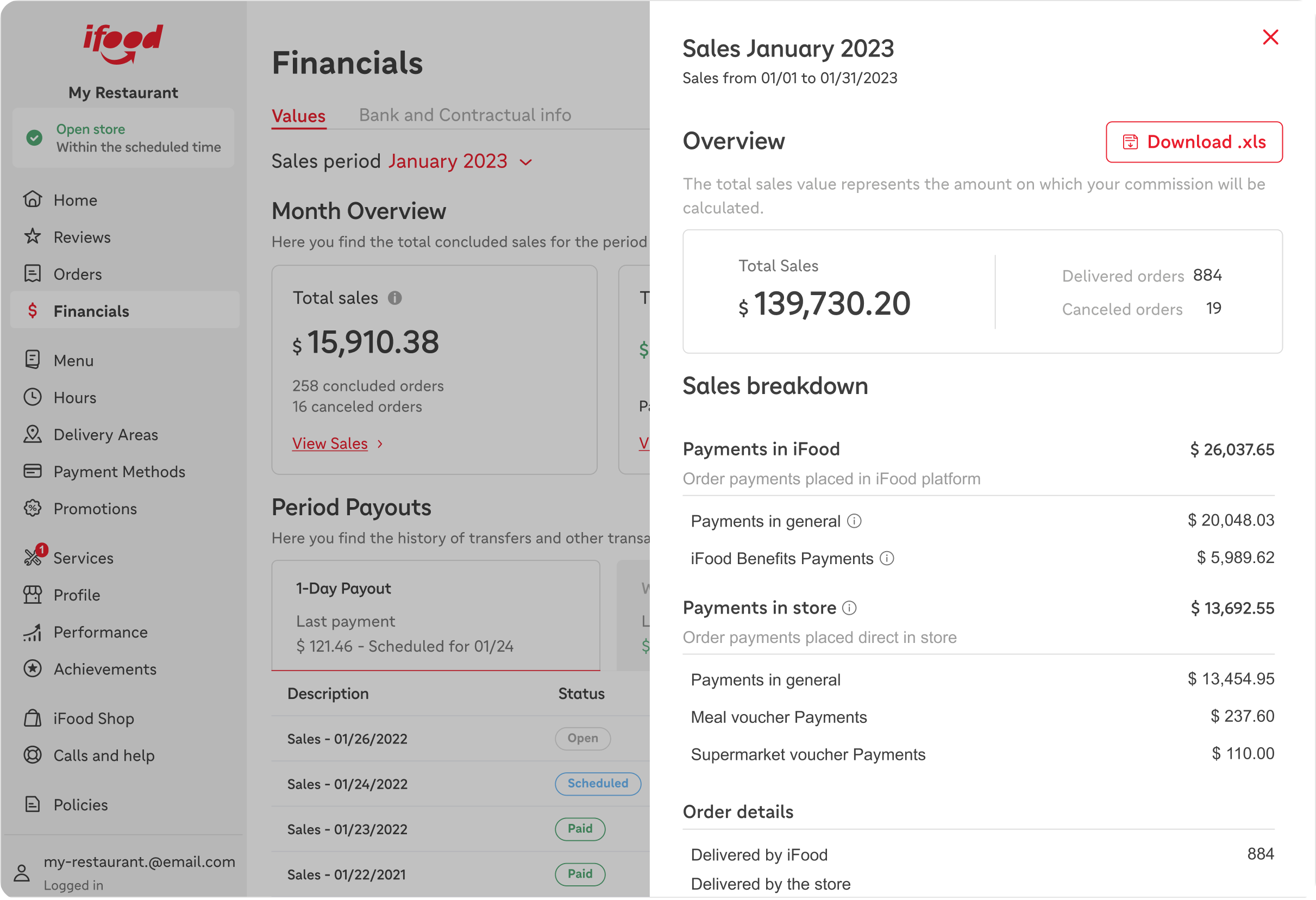
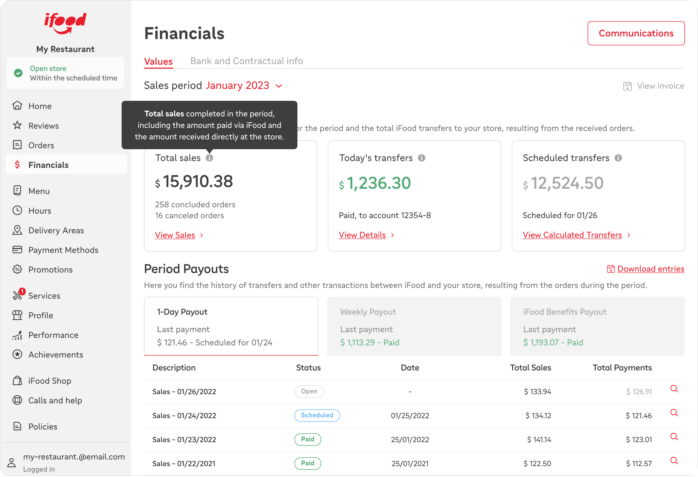
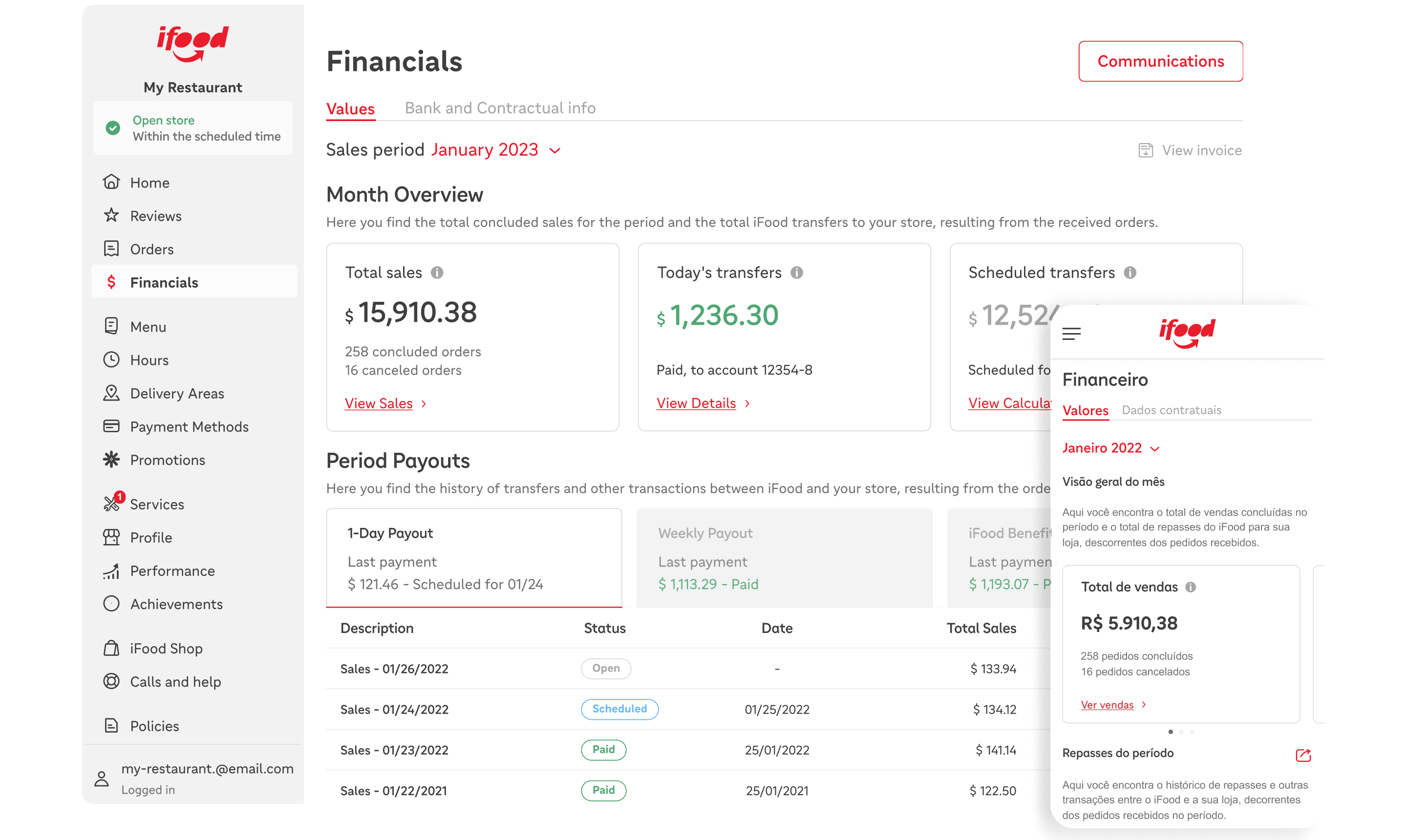
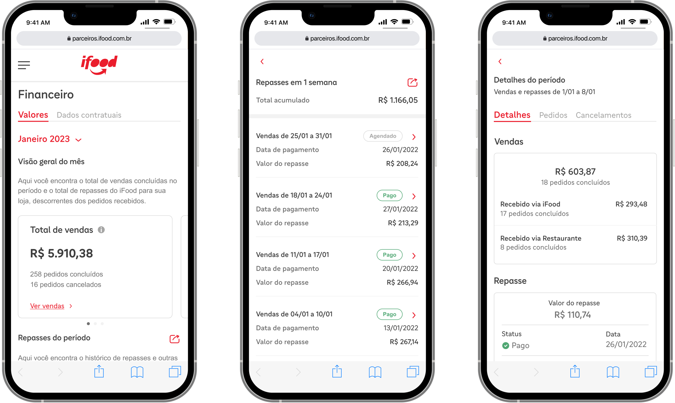
The 3-Box Model
Redesigned the dashboard around temporal mental models:
Past "How much did I sell?"
- Total sales completed
- Gives context for business performance
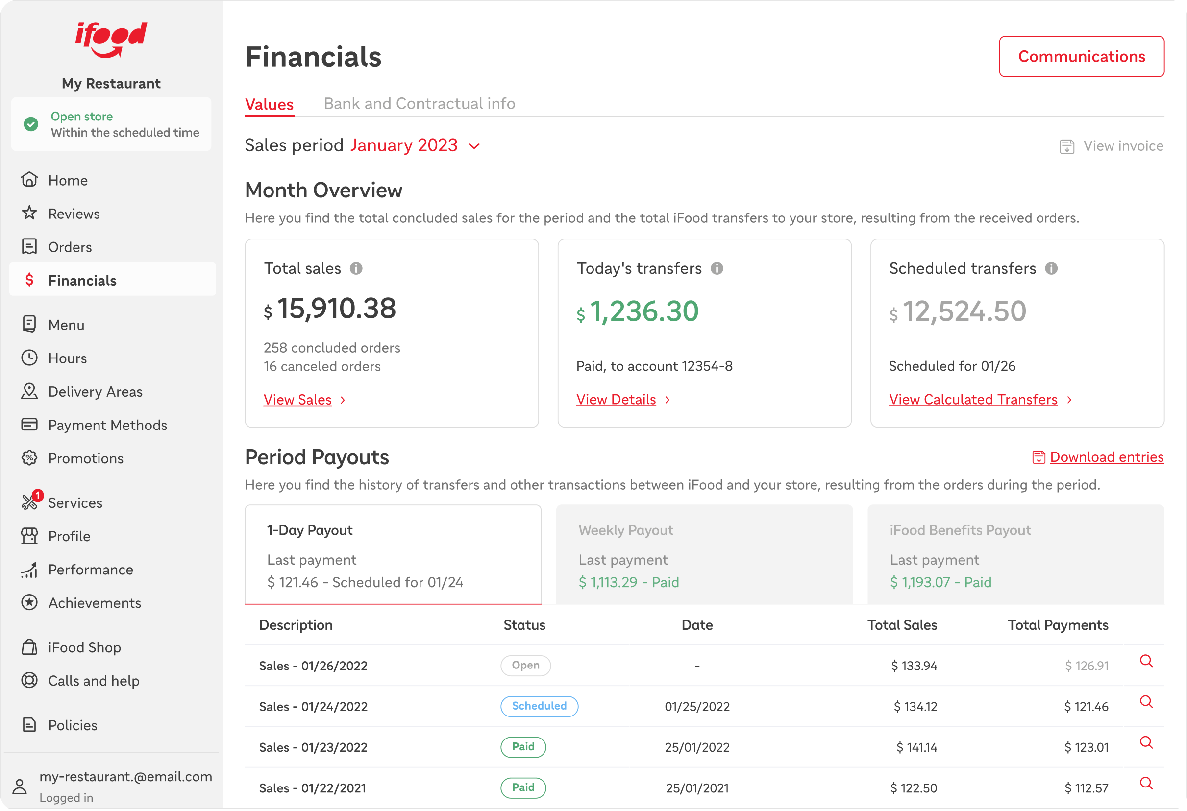
Present "What am I receiving today?"
- Today's transfers
- Answers the urgent cash flow question
Future "What's coming next?"
- Scheduled future transfers
- Enables planning and inventory decisions
Why 3 boxes, not 2 or 4?
- 2 boxes lacked sales context partners wanted
- 4 boxes overcomplicated and reduced scanability
- 3 boxes perfectly mapped to partners' mental timeline
Final Solution
Additional design decisions:
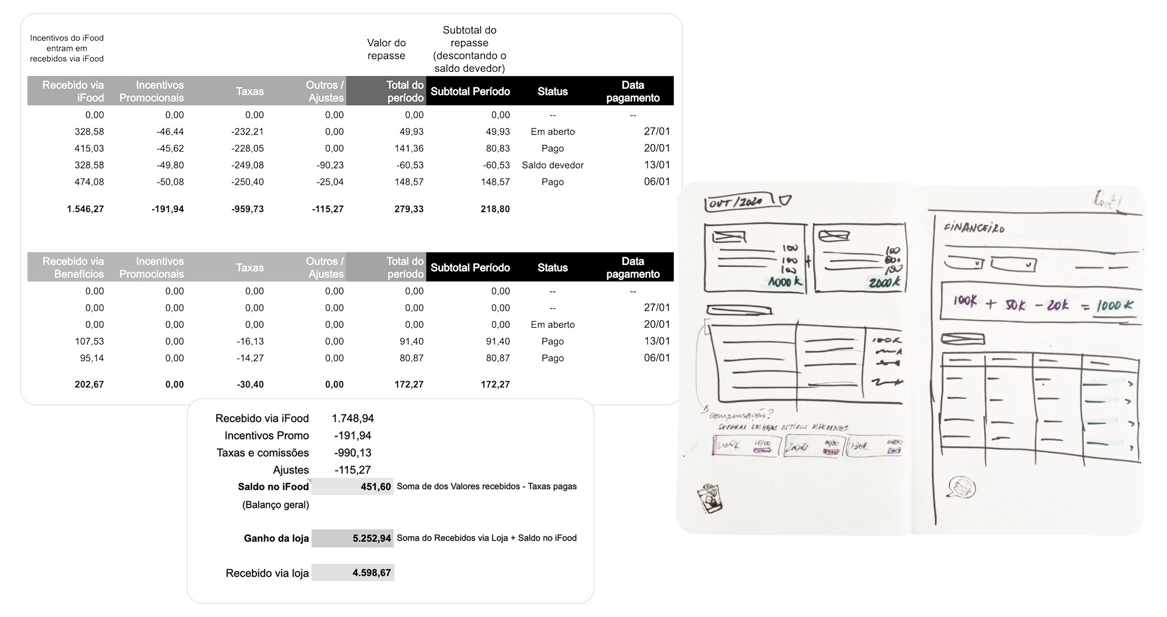
- Spreadsheet-style table below the boxes for detailed history—matching familiar tools partners already used
- Contextual tooltips explaining confusing terms (like "processing," "scheduled") right where confusion happened
- Large, scannable numbers with clear labels reducing cognitive load
- Mobile-responsive design for on-the-go checking at suppliers or markets
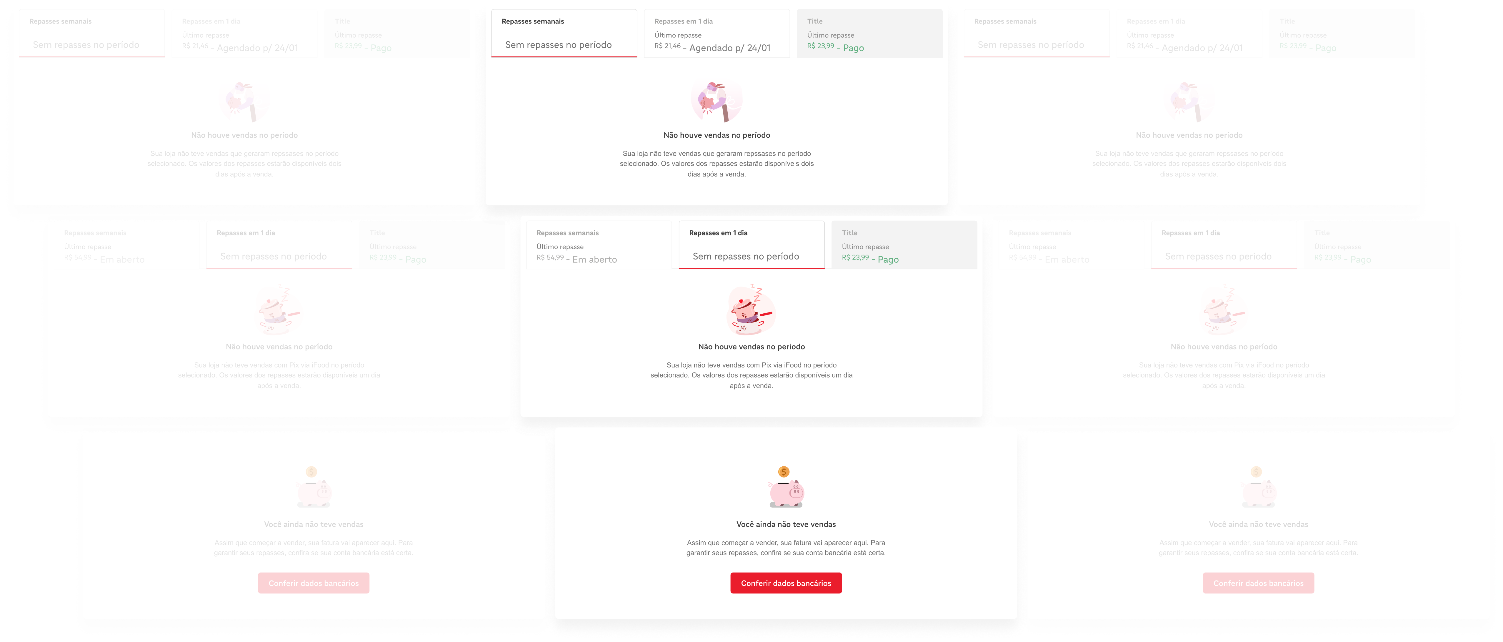
- Empty states with education helping new partners understand what would appear
The Research That Made It Work
What set this project apart: Deep empathy research during a crisis.
During remote interviews with SMB partners, we discovered:
- Many watched YouTube videos trying to understand the old dashboard—and still struggled
- Some kept parallel tracking systems (notebooks, Excel) because they couldn't trust the platform
- The disconnect between iFood's transfer model and their mental models caused constant anxiety
"I need to know what's coming tomorrow so I can buy supplies today"— Quote from research
This human insight that repeated over user interviews—not just data analysis—drove much of our design decisions. The 3-box model emerged from listening to how partners talked about money, not from design pattern libraries.
Impact Metrics
Scale:
- 100,000+ new partners onboarded during pandemic redesign period
- 3-box snapshot design implemented with past/present/future structure
- Responsive design serving both desktop and mobile users
User Experience:
- Reduced support tickets related to transfer dates and payment status (feedback from support team)
- Improved confidence in financial planning among new partners
- Enhanced financial literacy enabling better business decisions for SMB partners
- Positive stakeholder feedback on research-driven approach
Design Quality:
- Spreadsheet-style interface matched partners' existing mental models
- Contextual help system addressed top confusion points from research
- Temporal organization (past/present/future) proved intuitive across all partner segments
Team Impact:
- Framework established for future financial feature development
- Research insights informed multiple other product initiatives
- Engineering alignment on data requirements and architecture
Why This Matters
This case demonstrates design during crisis:
🎯 User empathy at scale: Understanding 100K+ new users unfamiliar with digital tools
🎯 Research-driven decisions: Mental models shaped solution, not assumptions
🎯 Balancing simplicity and depth: Snapshot overview + detailed table for power users
🎯 Temporal thinking: Organizing information by time, not accounting categories
🎯 Accessibility-first: Serving users with varying digital and financial literacy
🎯 Business impact: Reducing support costs while improving partner experience
The pandemic forced iFood to serve an entirely new user segment overnight. This project shows how thoughtful research and empathy-driven design can solve complex problems at massive scale.
Context Matters:
This wasn't just a dashboard redesign—it was a lifeline for small businesses during COVID-19. The design helped restaurant owners make critical decisions about inventory, staffing, and survival during an unprecedented crisis.